In web design, one common issue is that the footer doesn’t always stick to the bottom of the page when the content is short. Fortunately, with CSS Grid, it’s very easy to keep the footer down without using complex tricks or additional JavaScript.
Why the footer doesn’t stay at the bottom?
When your page content isn’t tall enough to fill the entire screen, the <footer> may float awkwardly in the middle. This looks unfinished and unprofessional. The solution lies in your layout strategy.
Using CSS Grid to keep the footer down
With just a few lines of CSS, you can tell the browser: “make the container at least 100% of the screen height, and distribute space between the header, main content, and footer.”
HTML
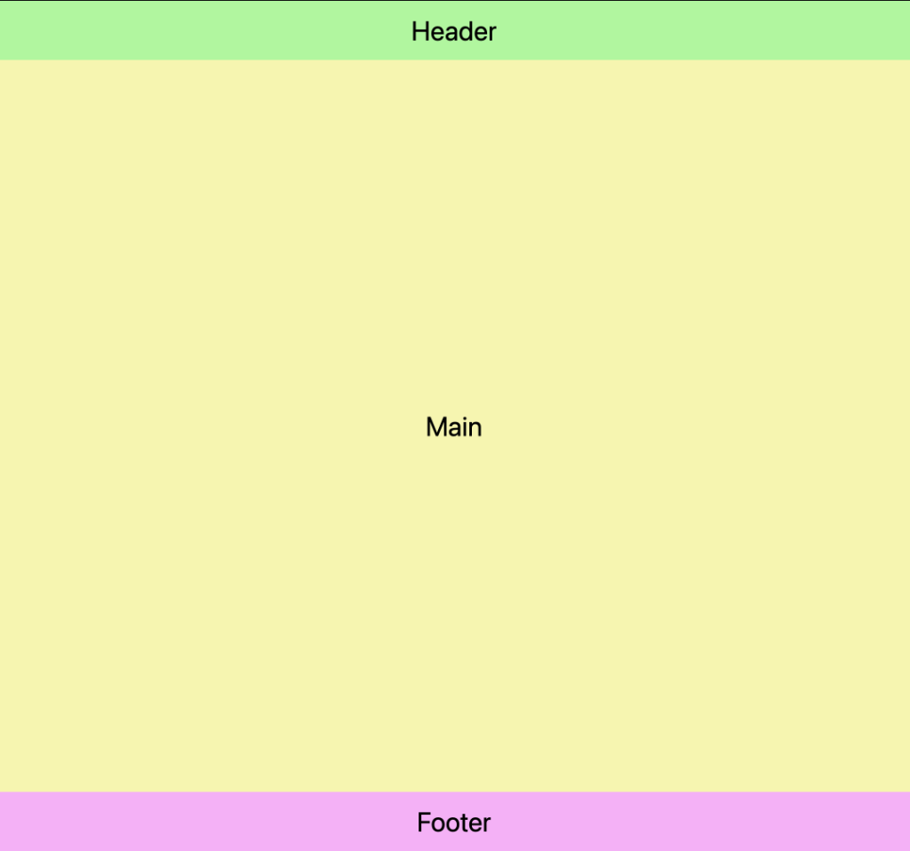
<div>
    <header>Header</header>
    <main>Main</main>
    <footer>Footer</footer>
</div>
CSS
div {
    display: grid;
    min-height: 100dvh;
    grid-template-rows: auto 1fr auto;
}
Code breakdown
display: grid: turns the container into a grid layout.min-height: 100dvh: ensures the container is at least the height of the viewport.grid-template-rows: auto 1fr auto; distributes the layout into three rows, the middle one expands to push the footer down.
Benefits of this modern technique
- Works in all modern browsers
- No need for
position: absoluteor flexbox hacks - Perfect for both simple and complex layouts
And that’s it, a clean, reliable way to keep the footer down using only modern CSS.
Do you know any other techniques that work well in your projects? Feel free to share them in the comments below!
Leave a Reply